Menus in C#

Menus provide groups of related commands for Windows applications.
commands depend on the program, some—such as Open and Saveare common to many applications.
Menus are very important part of GUIs, because they organize commands of the GUI.

How to create Menus in C#

To create a menu, open the Toolbox and drag a MenuStrip control onto the Form.
This creates a menu bar across the top of the Form (below the title bar) and places a MenuStrip.
icon in the component tray. To select the MenuStrip, click this icon.
Design mode to create and edit menus for your application.
Menus, like other controls, have properties and events, which can be accessed through the Properties window.
To add menu items to the menu, click the Type Here TextBox and type the menu item’s name.
This action adds an entry to the menu of type ToolStripMenuItem.


After you press the Enter key, the menu item name is added to the menu.
Then more Type Here TextBoxes appear, allowing you to add items underneath or to the side of the original menu item 


type an ampersand (&) before the character to be underlined.For example, to create the File menu item with the letter underlined, type &File.

To display an ampersand, type &&.
To add other shortcut keys (e.g., F9) for menu items, set the ShortcutKeys property of the appropriate ToolStripMenuItems.
To do ShortcutKeys , select the down arrow to the right of this property in the Properties window. In the window that appears, use the CheckBoxes and drop-down list to select the shortcut keys.
You can hide the shortcut keys by setting property Show ShortcutKeys to false, and you can modify how the shortcut keys are displayed in the menu item by modifying property ShortcutKeyDisplayString.


 You can remove a menu item by selecting it with the mouse and pressing the Delete key.
Menu items can be grouped logically by separator bars, which are inserted by right clicking the menu and selecting Insert > Separator or by typing “-” for the text of a menu item.
In addition to text, Visual Studio allows you to easily add TextBoxes and ComboBoxes (drop-down lists) as menu items.
Clicking the down arrow allows you to select the type of item to add


ToolStripMenuItem Properties


 •Checked: Indicates whether a menu item is checked. The default value is false, meaning that the menu item is unchecked.
CheckOnClick: Indicates that a menu item should appear checked or unchecked as it is clicked.
ShortcutKeyDisplayString: Specifies text that should appear beside a menu item for a shortcut key. If left blank, the key names are displayed. Otherwise, the text in this property is displayed for the shortcut key.
ShortcutKeys: Specifies the shortcut key for the menu item (e.g., -F9 is equivalent to clicking a specific item).
ShowShortcutKeys: Indicates whether a shortcut key is shown beside menu item text. The default is true, which displays the shortcut key.
TextSpecifies the menu item’s text. To create an Alt access shortcut, precede a character with & (e.g., &File to specify a menu named File with the letter F underlined).

ListBoxes in C#


•ListBox stores several text items. It can interact with other controls, including Button controls. We use this control in Windows Forms.


 ListBox Properties

BorderStyle: Gets or sets the type of border that is drawn around the ListBox.
HorizontalScrollbar:  Gets or sets a value indicating whether a horizontal scroll bar is displayed in the control.
Items: Gets the items of the ListBox.
RightToLeft: Gets or sets a value indicating whether text displayed by the control is displayed from right to left.
ScrollAlwaysVisible:  Gets or sets a value indicating whether the vertical scroll bar is shown at all times.
SelectedIndex:  Gets or sets the zero-based index of the currently selected item in a ListBox.
Sorted: Gets or sets a value indicating whether the items in the ListBox are sorted alphabetically.
Text: Gets or searches for the text of the currently selected item in the ListBox
TopIndex  : Gets or sets the index of the first visible item in the ListBox.
SelectedItems:  Gets a collection containing the currently selected items in the ListBox.


Item Methods


Item.Add(): Can use to add Items to the end of the Listbox.

Item.Insert(): Can use for insert items into Listboxز

Item.Sorted(): Can use for sorted all items in the Listbox.

Item.Remove(): Can use to remove items from the Listboxز

Item.RemoveAt(): Can use to remove items by indexز

Item.Clear(): Can use to clear all items in the Listbox.

ComboBoxes in C#

ComboBox is a combination TextBox with a drop-down.
Its drop-down list presents preset choices.

The user can type anything into the ComboBox. Alternatively, the user can select something from the list.

ComboBox Properties

DropDownHeight: Gets or sets the height in pixels of the drop-down portion of the ComboBox.
SelectedIndex:  Gets or sets the index specifying the currently selected item. 
SelectedItem:  Gets or sets currently selected item in the ComboBox.
SelectedText: Gets or sets the text that is selected in the editable portion of a ComboBox.
SelectionLength: Gets or sets the number of characters selected in the editable portion of the combo box.
SelectionStartGets or sets the starting index of text selected in the combo box.
Sorted: Gets or sets a value indicating whether the items in the combo box are sorted.
Text: Gets or sets the text associated with this control. 
DropDownStyle: Gets or sets a value specifying the style of the combo box.(Simple, Dropdown and dropdownlist)
DropDownWidth: Gets or sets the width of the of the drop-down portion of a combo box.
Items: Gets an object representing the collection of the items contained in this ComboBox.
MaxLength: Gets or sets the number of characters a user can type into the ComboBox.

Buttons in C#


•A button is a control that the user clicks to trigger a specific action or to select an option in a program. 


•As you’ll see, a program can use several types of buttons, such as checkboxes and radio buttons. All the button classes derive from class ButtonBase.

•Button, typically enables a user to issue a command to an application.


Button Properties


Font: Gets or sets the font of the text displayed by the control.

ForeColor: Gets or sets the foreground color of the control.

Location: Gets or sets the coordinates of the upper-left corner of the control relative to the upper-left corner of its container.

Name: Gets or sets the name of the control.

Padding: Gets or sets padding within the control.

TextAlign: Gets or sets the alignment of the text on the button control.

Visible: Gets or sets a value indicating whether the control and all its child controls are displayed.

Margin: Gets or sets the space between controls.

Enabled: Gets or sets a value indicating whether the control can respond to user interaction.

Visual Studio IDE

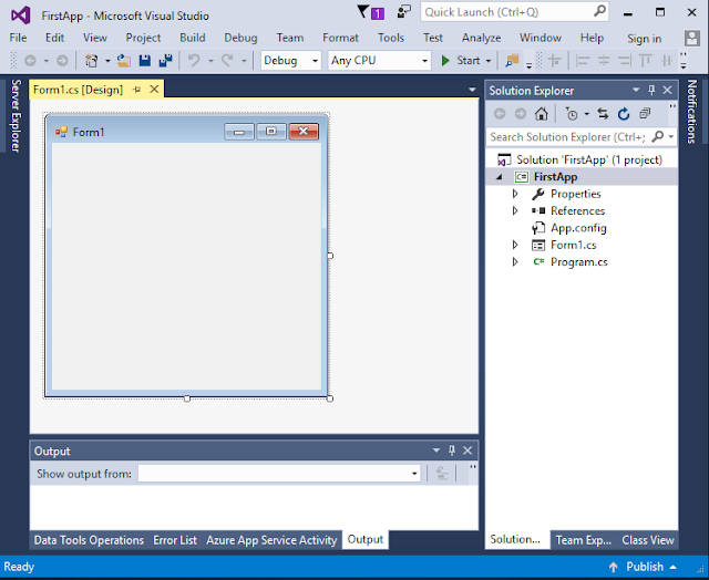
This article will give you an overview of Visual Studio IDE and explain some important part of the IDE such as ToolBox, Property Window and so on.


Visual Studio IDE


Visual Studio IDE ToolBox


The controls and components are organized into categories by functionality.
Selecting the category All Windows Forms at the top of the Toolbox allows you to view all the controls and components from the other tabs in one list .

To add a control or component to a Form, select that control or component from the Toolbox and drag it on the Form. 


Properties Window

The Properties window is crucial to visual programming.
It allows programmers to modify a control’s properties visually, without writing code.
Programmers can see which properties are available for modification and, in many cases, can learn the range of acceptable values for a given property.
The Properties window displays a brief description of the selected property, helping to understand its purpose.


A property can be set quickly using this window, and no code needs to be written.

At the top of the Properties window is the component selection drop-down list, which allows you to select the Form or control whose properties you wish to display in the Properties window.

 Using the component selection drop-down list is an alternative way to display a Form’s or control’s properties without clicking the actual Form or control in the GUI.

Events


 Event: is the action that is used to perform a method or a task

The control that generates an event is known as the event sender.

An event-handling method—known as the event handler—responds to a particular event that a control generates. When the event occurs, the event sender calls its event handler to perform a task.


Creating Event Handler

 you double clicked the Button control on the Form to create its event handler. This technique creates an event handler for a control’s default event—the event that is most frequently used with that control.

Controls can generate many different events, and each one can have its own event handler. 

Some Event

 Click : This event is used to perform a task whenever a control has clicked.

MouseHover: This event is used to perform a task whenever the mouse pointer has moved on the control.

KeyPress: This event is used to perform a task whenever a key has pressed.

TextChanged: This event is used to perform a task whenever a text has changed in the text box.


Forms in C#

Windows Forms are used to create the GUIs for programs.
A Form is a graphical element that appears on computer’s desktop; it can be a dialog or a window.
A control, such as a Button or Label, has a graphical representation at runtime. However, some components lack graphical representations (e.g. Timer ) 


Windows Forms Properties


This section will explain some useful Form properties that can be used in your application.

AcceptButton: Button that is clicked when Enter is pressed.
AutoScroll : bool value that allows or disallows scrollbars when needed.
CancelButton: Button that is clicked when the Escape key is pressed.
FormBorderStyle :Border style for the Form (e.g., none, single, three-dimensional).
Font: Font of text displayed on the Form
Text: Text is used to change the form’s label or title
Close: Closes a Form and releases all resources, such as the memory used for the Form’s content s. A closed Form cannot be reopened.
Hide: Hides a Form, but does not destroy the Form or release its resources
Show: Displays a hidden Form.

Labels in C#


The Label control is probably the most frequently used control of them all.
Label is a simple control with one purpose only (to display text on the form).
Usually, you don’t need to add event handling code for a standard Label, although it does support events, like all controls.

You can set a number of properties for the Label control.

•AutoEllipsis: Gets or sets a value indicating whether the ellipsis character (...) appears at the right edge of the Label, denoting that the Label text extends beyond the specified length of the Label.


Design a Digital Clock


To design a simple digital clock we need the following controls and classes:

1 - labels: to display time on it.
2 - Timer Control: to call the time .

Enabled : Gets or sets a value indicating whether the Timer should raise the Elapsed event.
Interval: Gets or sets the interval at which to raise the Elapsed event.
Start: Starts raising the Elapsed event by setting
Enabled to true.
Stop: Stops raising the Elapsed event by setting
Enabled to false.

3 - DataTime class: to obtain time.

DateTime class is used to obtain date and time.
To return the current date and time we use
DateTime.Now
For example,

Datetime now = new DateTime.Now;


Now Lets start the design

First of all drag two labels to the form then drag a Timer Control and change the properties as following:


● Label1:
– Text: Time
– Font: 16 bold
● Label2:
– Text: empty
– Font: 16 bold
● Timer:
– Interval:1000

– Enable : true

Then write the following code in the form load

private void Form1_Load(object sender,
EventArgs e)
{
timer1.Start();
}

Then write the following code in the timer event

private void timer1_Tick(object sender,
EventArgs e)
{
DateTime now = DateTime.Now;
label2.Text = now.ToLongTimeString();
}